


Canan Şebnem Canpolat - 4
The line graph below shows changes in the amount and type of fast food consumed by Australian teenagers from 1975 to 2000.
Summarize the information by selecting and reporting the main features and make comparisons where relevant.
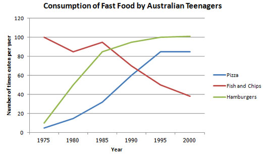
The line graph compares three fast food products; namely, pizza, hamburgers, fish and chips that were consumed by the teenagers of Australia between the years 1975 and 2000, a period of 25 years. Overall, it is seen that while the consumption of fish and chips declined gradually over the years, that of hamburgers and pizza increased.
At the beginning of the period, the rate of consumed fish and chips was far higher than those of the others, being eaten 100 times a year. Obviously, it was the most popular fast food in 1975. Hovewer, apart from a brief rise from 1980 to 1985, the consumption of fish and chips declined gradually over the full time period to finish at just under 40.
In sharp contrast to this, teenagers began to prefer hamburgers and pizza more and more every year. At first, the amount of pizza and hamburger consumption started in similar patterns which was approximately 5 times a year. Following the period, pizza consumption rose gradually until it overtook the consumption of fish and chips in 1990. After this year, it levelled off. The main ascent was seen in the consumption of hamburgers as it followed a sharp increasing trend thoroughout the 25 years timescale and finished the period at specifically where the fish and chips began with the consumption of 100 times a year.
Comments
Post a Comment