Furkan Odabaş - 3
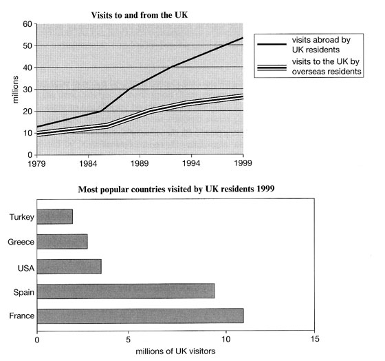
The line graph shows visits to and from the UK from 1979 to 1999, and the bar graph shows the most popular countries visited by UK residents in 1999.
Summarize the information by selecting and reporting the main features and make comparisons where relevant.

The line graph demonstrates the numbers of visits in millions which were made by the UK residents to other countries and overseas residents to the UK from 1979 to 1999 while the bar chart shows the numbers of visits to different countries, which were visited by the UK residents, in millions in 1999. Overall, it can be clearly seen that both of the visits to and from the UK increased whereas France was the most popular country for the UK visitors.
To begin with, the numbers of visits to and from the UK were similar and near to 10 million. They also rose constantly for 20-years of timeframe except the number of visits abroad by the UK residents which showed a sharper rise than the number of visits to the UK by overseas residents. In 1999, visits from the UK visitors were just under 55 million while the visits to the UK from overseas visitors were just over 25 million which is approximately half of visits from the UK residents.
Lastly, France was the most popular country with slightly over 11 million visitors, followed by Spain with 9 million visitors. The USA, Greece and Turkey were far less popular than France and Spain with 4,3, and 2 million of visitors, respectively.


Comments
Post a Comment