Emircan Yayla - 2
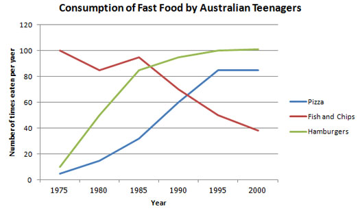
The line graph below shows changes in the amount and type of fast food consumed by Australian teenagers from 1975 to 2000.
Summarize the information by selecting and reporting the main features and make comparisons where relevant.

The line graph illustrates the consumption of three types of fast foods by Australian adolescents over a period of 25 years, from 1975 to 2000. Overall, it can be seen from the graph that tthe consumption of hamburgers and pizza increased between 1975 and 2000 in Avustralia, while the figure for the consumption of fish and chips went down in this time period.
Firstly, in the year 1975, the number of fish and chips eaten by the teenagers in Avustralia was 100, while appoximately 12 numbers of hamburgers and pizza were consumed by the young people in this year. However, the number of fish and chips went down for five years and then started to rise again for another five years, but after the year 1985, it followed a dramatic decreasing ternd to reach under the 40 number per year in the year 2000, whereas the consumption of hamburgers and pizza increased simultaneously until around 1980 and 1995, respectively..
Looking at the information in more detail, we can see that the consumption of hamburgers had a growth until the year 1995, and after this year, it remained stable and the number of eaten pizza went up gradually to reach its peak point at 100.


Comments
Post a Comment