Deniz Kahraman - 1
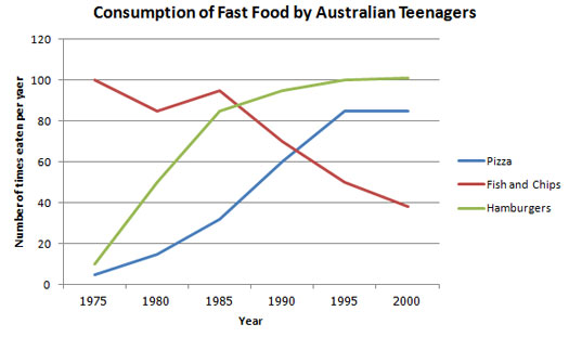
The line graph below shows changes in the amount and type of fast food consumed by Australian teenagers from 1975 to 2000.
Summarize the information by selecting and reporting the main features and make comparisons where relevant.

The line graph illustrates the comparison of three types of fast food consumption by adolescents in Australia from 1975 to 2000. Overall, it is seen that the consumption of Fish and Chips declined over the given period, while that of Hamburgers and Pizza followed a similar path, by increasing steadily until the end of the period.
It is clear from the graph that the consumption of pizza and hamburgers demonstrated almost same figures. In 1975, pizza and hamburgers consumption were nearly 10 per year. After then, in 10 years, eating hamburgers increased sharply to more than 80 number per year which was three times more than pizza consumption. Similarly, from 1985 to 1995, pizza consumption rose steeply to reach its highest level, when the number of eaten hamburgers got to the same level as fish and chips consumption in the beginning of the period, with 100 times a year.
On the other hand, the graph of fish and chips was completely in different direction. Australian teenagers' favourite food was fish and chips in 1975, 100 times per year, which fluctuated over a ten-year period. It is observed that from 1985 to 2000, Fish and chips consumption followed a dropping inclination, from approximately 95 to less than 40 times per year.


Comments
Post a Comment