


Merve Cura - 8
The graph below shows the proportion of the population aged 65 and over between 1940 and 2040 in three different countries.
Summarise the information by selecting and reporting the main features, and make comparisons where relevant.
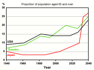
The line graph illustrates the number of people who are 65-year-old and over, from the year 1940 to 2040 in the USA, Sweden, and Japan. Overall, none of the given countries' elder population was higher than 10% in 1940. During the given time period these three countries' numbers of people aged 65 and over showed different trends. It is predicted that the proportion of the people this age group will increase significantly in the next two decades.
It can clearly be seen that the elder populations in the USA and Sweden demonstrated similar trends from 1940 to the end of the 1990s. From 1990 onwards, given population in Sweden showed a fluctuating upward trend, while the rate in the USA remained same, until the beginning of 2020s. It is anticipated that the elder population in Sweden will rise to 25%, slightly larger than the population in the USA.
A brief examination of the graph reveals that Japan showed and will set to show a completely different trend. In 1940, 5% of the Japan's population consisted of people aged 65 and over. This percentage dropped slightly and remained under 5% until the beginning of 2000s. The rising trend of the number of elder people in Japan started in 1980s and it is projected to rise dramatically toward the end of the given time period.
Comments
Post a Comment